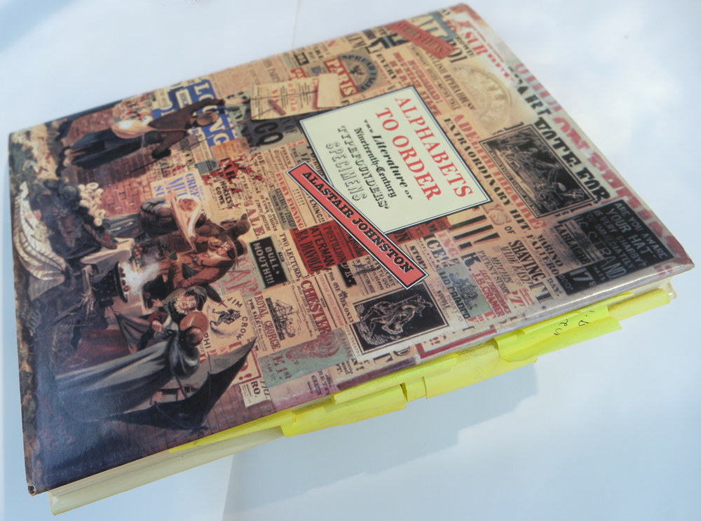
Alphabets to Order: the Post-it® Edition by Alastair M. Johnston
People often say their favorite among my books is Alphabets to Order. — That’s because you haven’t read any of the others, I say. In Alphabets I explored the neglected era of typography when technology trumped aesthetics. From a typographical point of view, the nineteenth century is one that time forgot. The Victorian epoch is a wasteland from most graphic designers’ point of view, and the depredations of International Typeface Corporation (ITC) in the 1980s on the more excessive designs of a century earlier did nothing to endear readers to those typefaces. The whole era was terra incognita until Nicolete Gray’s Nineteenth Century Ornamented Typefaces (Berkeley: UC Press, revised ed, 1976) and Rob Roy Kelly’s American Wood Type (New York: Van Nostrand, 1969), made their forays and brought their own taste to a largely tasteless period. The nineteenth century was one of technological explosion in type design: it moved from the hand punch-cutter to the pantograph, from types laboriously cut in steel by skilled engravers to the rapid cloning (and piracy) of designs cut in soft metal and reproduced through galvanization in a tenth of the time.
We have witnessed a similar period of technological change from the dark days of photo-type (ITC) thirty years ago, through the vectors and rasters of the digital revolution and the explosion of the world wide web, to screen reading on phones and other gadgets. But this is still infant technology and issues of legibility are not being addressed fast enough, while spelchekrs make everyone dumber.
Brewster Kahle, founder of the Internet Archive, gave the Regent’s Lecture at UC Berkeley’s Morison Library on 3 March 2016. After his talk I expressed my concern with the state of archived information as it progressed from microfilm to CD-Rom and now to the internet. Giving examples of the problems I frequently encounter I asked him if he felt we had finally got it right, or if it would have to all be done over? He agreed that as technology improves we do need to go back and start over. What can I say, I am sorry! he said. Holding a book you can feel the paper, see the watermark, the impression of the type, the bite of the etched plate, the hand work in the binding and so on. All of these tactile elements which are essential clues to scholars, are lost in the digital image. Librarians will say it preserves the real work for future scholars but at the same time it keeps people away from the proper experience of the book.
I devised my own reason to look at the rare specimen books housed in San Francisco, Chicago, Columbia University, New York, the St Bride Library in London and elsewhere. My approach to the typefounders’ catalogues was to read them as literature to see what they were about, something no one had much bothered with before. I wrote Alphabets to Order (London: British Library, 2000) in pencil on hotel notepaper and typed and retyped it on an IBM Selectric: cut & paste was achieved by a penciled circle, a caret and a marginal note “Insert here.” Many of those founders’ merchandise catalogues exist only in one copy (or in variants), and even today copies are seldom found digitally and those libraries that are accessible will not let you flop their books onto a flatbed scanner (only this year the British Library has given up on Xerox and now allows patrons to bring their own cameras into the reading room). Copies of specimen books in private hands often disappear for decades, even institutional copies can go missing for long periods.
Mrs Gray’s pioneering work of nineteenth-century type is described by Nicolas Barker in his obituary of her in the Independent:
It is hard to overestimate the importance of this book, small and sparsely though efficiently illustrated. At a time when Victorian printing was regarded with contempt and neglect, she viewed it with a trained epigraphist’s eye and an inherited sympathy for the period. The book also played a major part in rousing interest in “English Vernacular”, the native originality of script and decoration expressed in tombstones, pub signs and the like.
For the first edition of her book, published by Faber in 1938, Mrs Gray traced the letterforms and made pen and ink facsimiles of the characters. This was very unsatisfactory, despite her care and attention. As an epigrapher and stone-cutter she was used to tracing classical inscriptions, and close-up photography was still complicated in the 1930s. But there is no doubt she was in the avant-garde: in 1936 she organized the first exhibition of abstract painting in England which included Kandinsky and Mondrian.
 Nicolete Gray, Nineteenth Century Ornamented Typefaces, London: Faber, 1938. Mrs Gray’s drawing of a Wood & Sharwoods typeface, and below it the actual typeface in Wood & Sharwoods specimen book, 1842, which Mrs Gray calls “A nice example of the basic English vernacular.”
At the same time linguists and philosophers like Walter Benjamin noted that the mode of human sense perception is constantly changing. These were first steps in analyzing cognitive reality which would evolve into a sleeker more physical science. Drawn letterforms from 1938 have given way to a demand for high-resolution images of originals shot in raking light* in order to show the very impression of the metal characters which made the letters.
- “These macro-enlargements are new high-resolution digital images captured with raking light. This reveals the impression of the metal type into the surface, the ink ‘squeeze’, and even the surface quality of the paper or vellum with a clarity and vividness which I believe has not been seen before.”– Stan Knight, Introduction to Historical Types (Oak Knoll Press, 2012, p. 9)
Other factors such as printing techniques and quality of reproduction gained notice as the audience became increasingly sophisticated. But perhaps we rely too much on computers today: you can’t trust the internet. WorldCat blithely tells us all these book exist but when it comes down to it, they are ghosts (You click on a library link in WorldCat and get the message, “If your book existed it would be here”). Or they have a later edition, or, the dread words: it’s on microfilm. Microform was used in the 1920s and ’30s to film books and newspaper pages — to free up space (many newspapers were then discarded) in libraries. Text is barely legible and any artwork turns to oatmeal. Later efforts, like Project Gutenberg, sought to convert these texts back into word files by means of OCR, a major disservice. Anyone will tell you of their frustration at finding an author’s works on line then coming across something like “The thought of writing carne to me today” — a “quote” from W. H. Auden I encountered yesterday. After that how can you trust (or reliably quote) anything you read on line?
The revised edition of Gray had much improved illustrations from line shots. (Even in the 1970s, when I was examining specimen books, libraries who allowed photography insisted on “no flash” and even “no tripods” — the available lighting was usually fluorescent, adding a putrid greenish yellow tone to the images.) Thus these institutions retained a queasy balance between allowing access and retaining exclusivity of their treasures.
An extreme example of this schizophrenia was seen in Phillips’ Old-fashioned Type Book (New York: Frederic Nelson Phillips, 1945): the mean-spirited Fred Phillips made photo-stats from type specimen books but, terrified that he was creating free clip-art, printed all the cuts in non-reproducing photo blue, despite the fact these degraded zincs would be unsuitable for reproduction anyway.
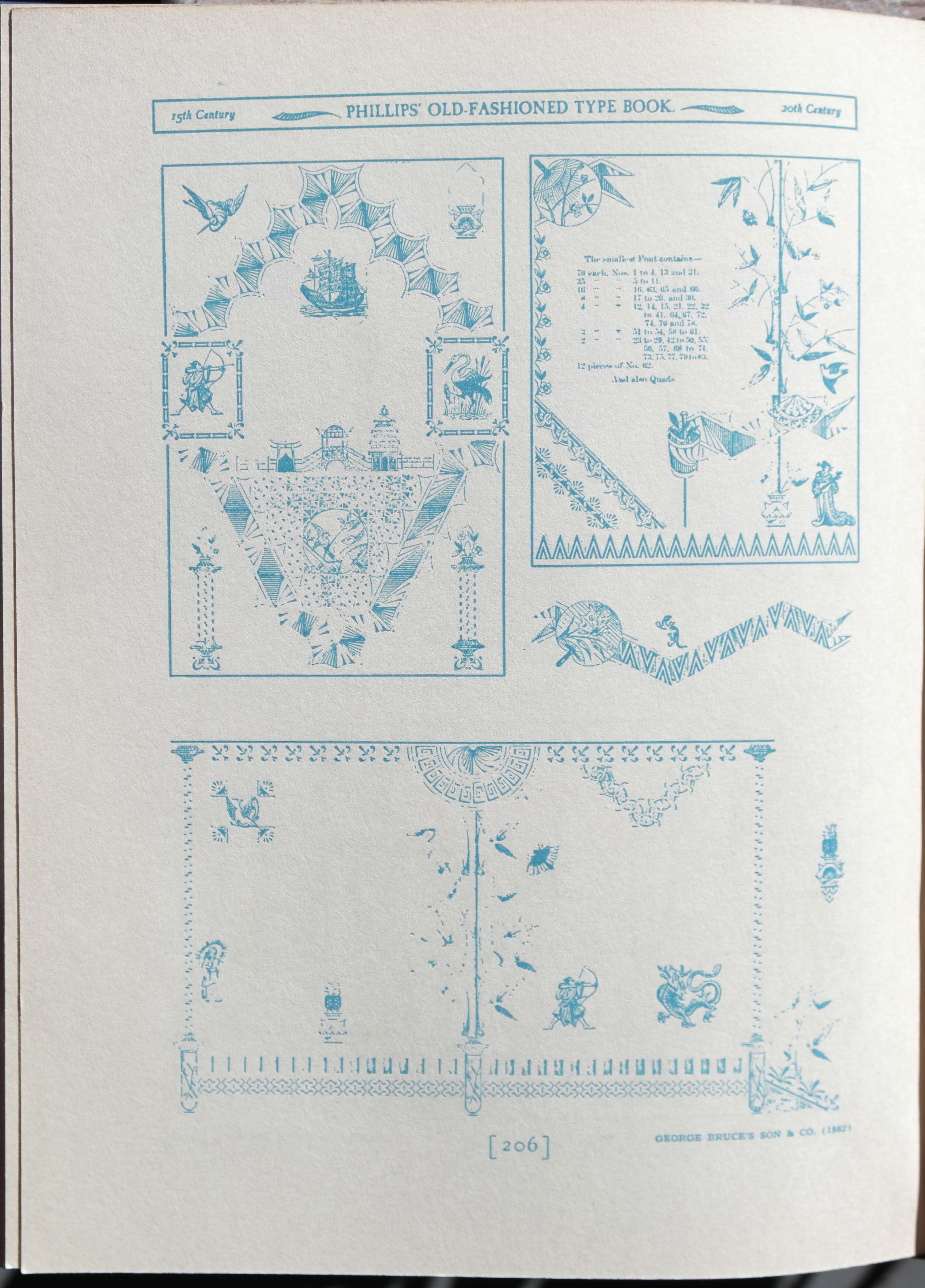
Fred Phillips’ Old-fashioned Type Book (New York, 1945)
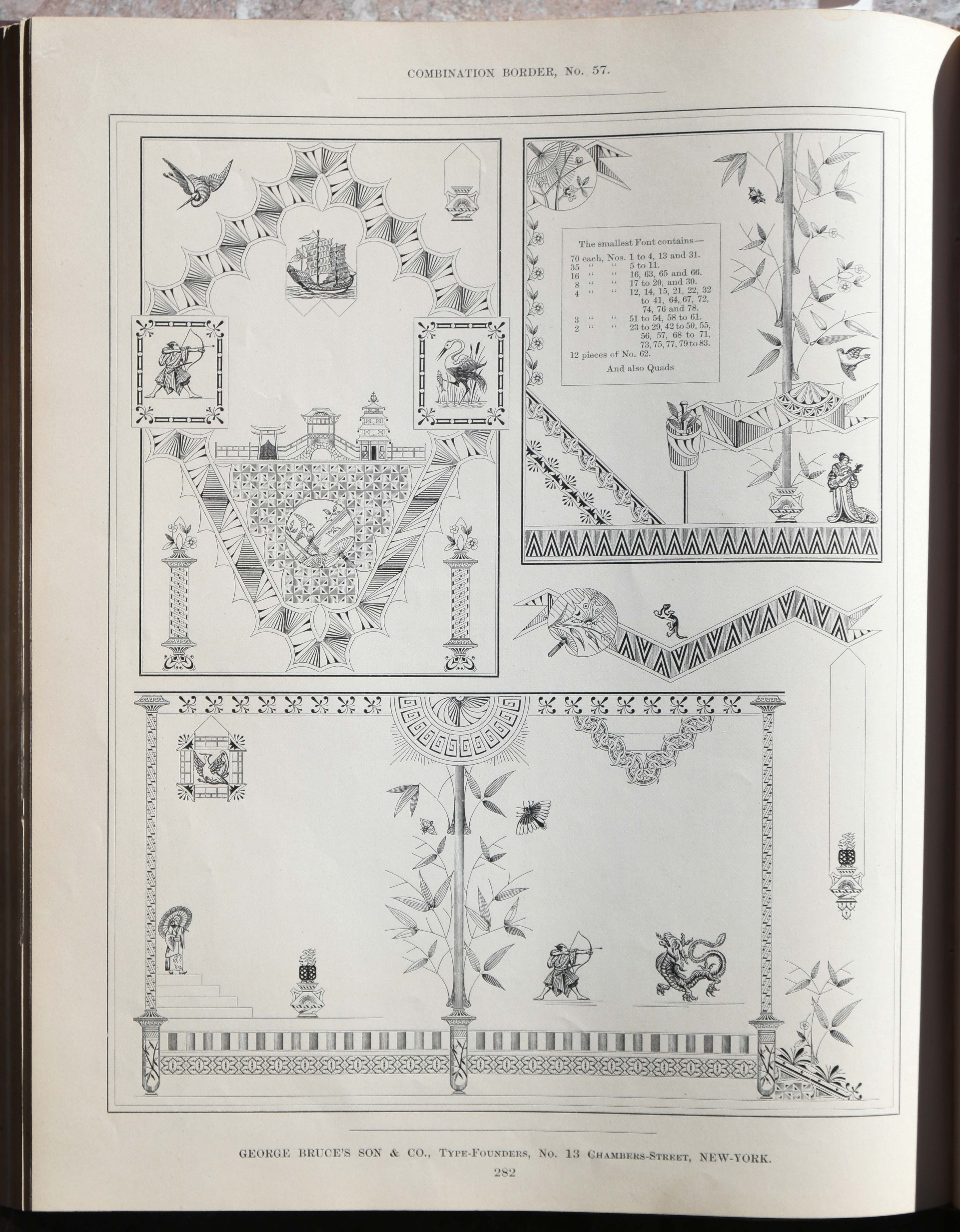
George Bruce’s Sons’ Combination Japanese Border & Ornaments designed by August Will, 1880.
Left: Frederic Phillips’ Old-fashioned Type Book (New York, 1945) in non-photo blue, but lacking fine details (& information); right: George Bruce’s Sons’ Combination Japanese Border & Ornaments designed by August Will, 1880.
My original goal was to find forerunners of Dadaism in the specimen books, and I found plenty of nonsense suggesting that the founders, like Lewis Carroll, Edward Lear, Horace Walpole and other pioneers — going back to Swift and Sterne and earlier to Rabelais — were picking up on deeply ingrained cultural channels and a creative mind’s desire to play with the boundaries of written language. In case you need a reminder, Rabelais has frozen words and syllables falling as hail (“paroles gelées fondant comme neige”) and thawing on board his boat in little explosive sounds (Gargantua & Pantagruel, chap 56): “Pantagruel threw on deck handfuls of frozen words, which looked like crystallized sweets. We saw gobs of words, gay quips — azure, vert, sable, or — golden words, which, warmed a little by our hands, melted like snow, and we heard them, but it was an alien tongue.”
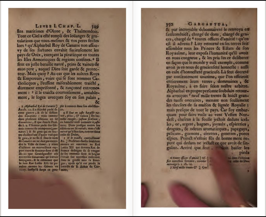 Aside: what’s with the ‘jazz hands’ (which appear throughout), and also why is the even-numbered page on the right? [source: Internet Archive archive.org/details/oeuvresdemaitre02rabegoog349]
The idea that we can control all knowledge by understanding all languages goes back to Athanasius Kircher and his fanciful exploration of hieroglyphics and the Tower of Babel, thence up through Bishop Wilkins and his Universal language (Pantographia, 1799, p. 234). But Wilkins himself was dubious of attempts to fit everything into a God-controlled knowable universe, criticizing those “who upon the invention of any new secret, will presently find out some obscure text or other to father it upon.” (Discourse I, 172) A typographical manifestation of this was Edmund Fry’s Pantographia (London, 1799) which sets out the Lord’s Prayer in all the known languages of the world. I had fun with this in an “easter egg” in footnote 9 on page 21 of Alphabets, a reference to Nova Zemblan, which I couldn’t pass without inventing a source by the fictional John Shade (the protagonist of Pale Fire).
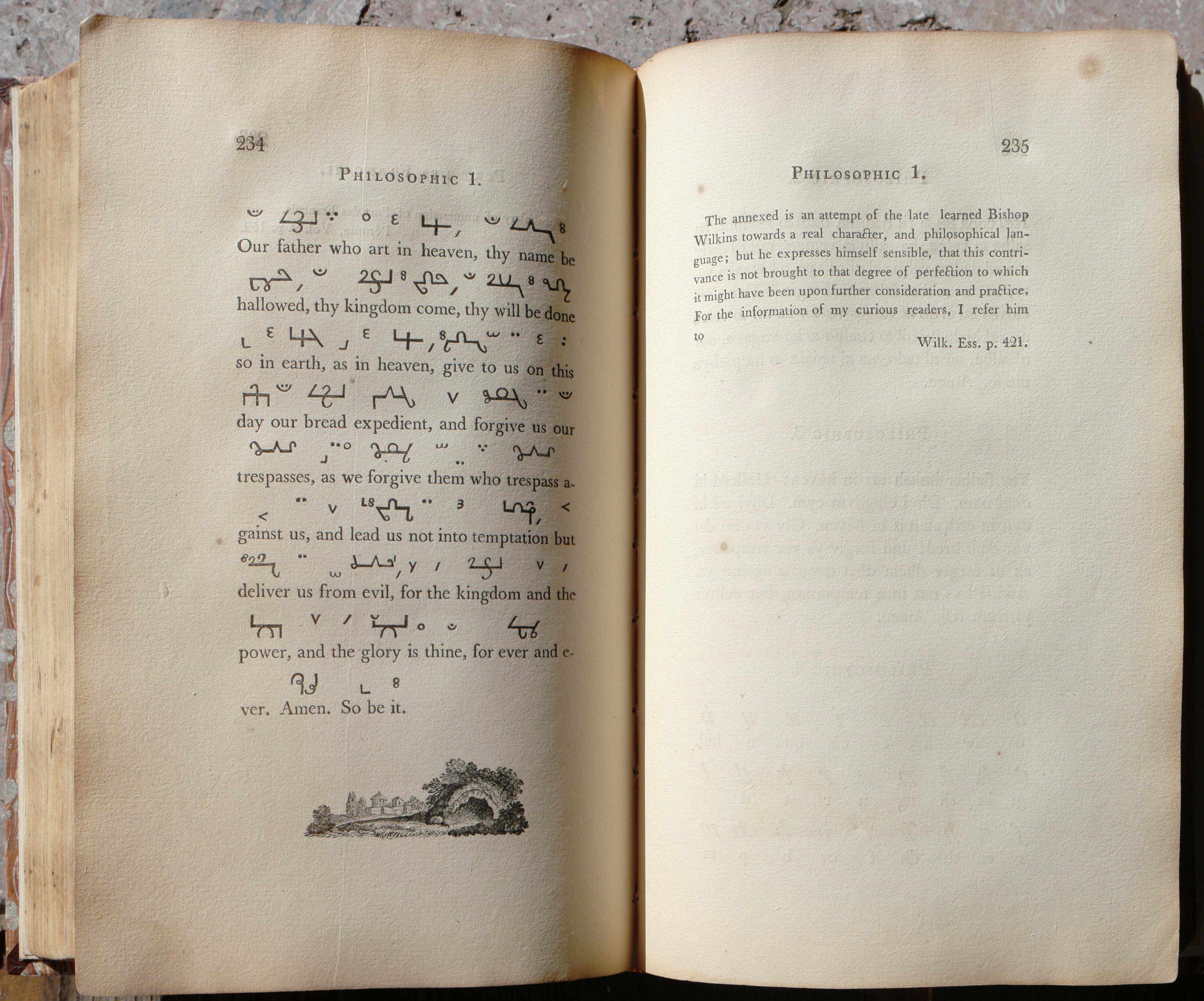
Bishop Wilkins “Philosophic” from Fry’s Pantographia 1799
Nicolas Barker, who knew Nicolete Gray, remembers a conversation with her where they compared the tight-waisted dresses with bustles of the 1870s to the typefaces of the Victorian era. I was fortunate to have Mr Barker read my manuscript. He did so on a plane trip from London to Los Angeles, and since this was in the days before everyone nestled in with their smart phone so their connection to the universal manas below them would be uninterrupted, it was a sign of his innate brilliance that he found so many things to correct from his own knowledge, in a work that I had spent a decade hacking out of raw material (a lot of it actual wood-pulp).
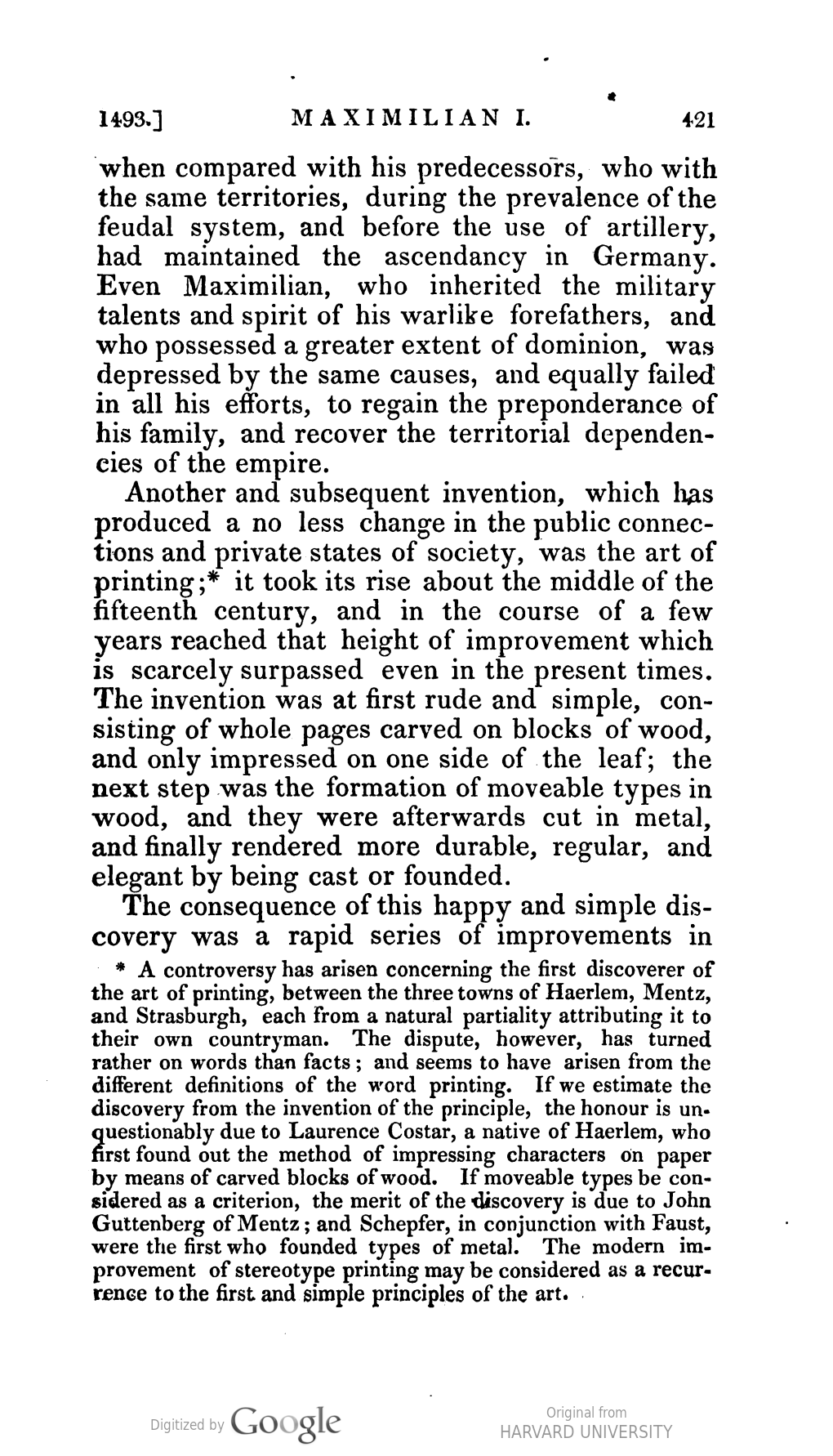
Many of my references led far off the beaten track into dense bibliographical thickets. You know the story of Dr Joyce Brothers (the advice columnist) who appeared on the $64,000 Question TV show to answer questions about boxing? The producers didn’t like her and decided to scuttle her with a curveball question by asking her the name of the referee in a bygone title fight. She knew it. So when I mentioned The History of the House of Austria from 1218 to 1792 by the Archdeacon of Wiltshire, Mr Barker suggested I would find something relevant in a footnote of the corrected Second edition. He knew this because the second edition was printed by T. C. Hansard, a scholar of the history of printing. It’s a six-volume work and the footnote appears on page 421 of the first volume, which I found scanning the notes quickly in the stacks of the UC Berkeley library. (Oh, for the internet then!)
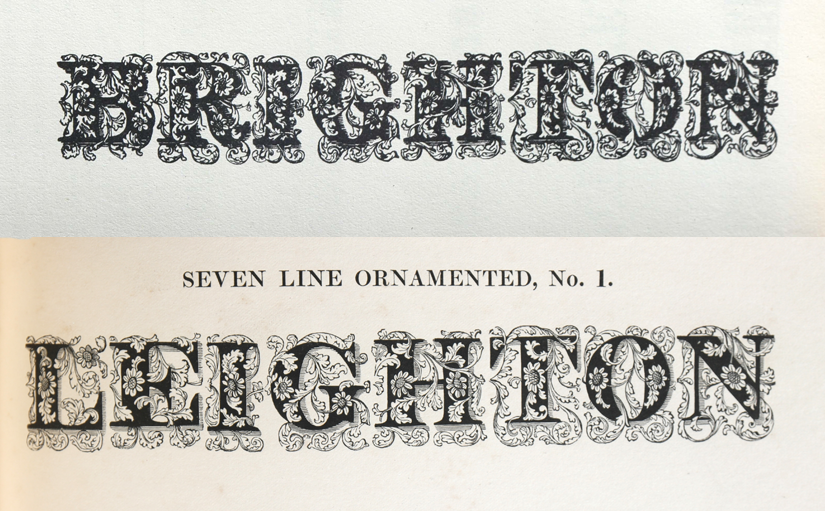
But Mr Barker went further afield (or thicketward) on another quote I had found, from William Thorowgood, the English typefounder who won the lottery and bought out Thorne (I suspect some shenanigans as Thorowgood had a relative who printed the lottery tickets). Thorowgood, I had decided, was a proponent of Surrealist texts. After all he had this tantalizing quote: BRIGHTON IN 40 SECONDS (which is even faster than the short film, “London to Brighton in Three-and-a-half Minutes”, aired by the BBC in 1953). Railway trains, the newest-fangled mode of transport, were very much under discussion in the 1840s.
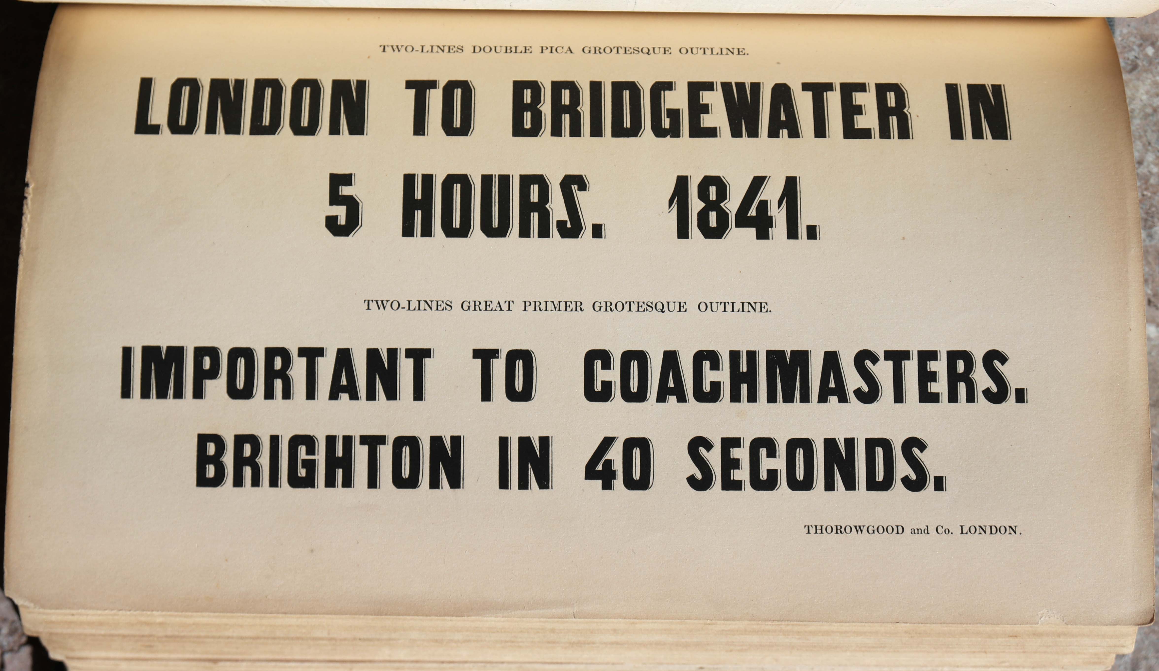
Thorowgood specimen, circa 1841
In his specimen, Thorowgood referred to the “Atmospheric Railway.” I had no idea there really had been such a thing (thinking Mr T had made it up), until I was taking a Great Western Railway train to Cornwall and looking out of the window, on the port side of the train to enjoy the coastal view, I glimpsed a sign as we pulled out of a station in South Devon, “Site of the Atmospheric Railway built by Isambard Kingdom Brunel, 1844.” Brunel saw the potential for using air pressure and a partial vacuum to propel railway carriages. However rats ate the leather valve-covers, breaking the vacuum and the system was abandoned. One was also built in Dalkey, county Dublin, which would have appealed to Flann O’Brien — but I digress. Barker took me off on another tangent, by pointing out the reference to atmospheric railways in a French conversational manual (Alphabets to Order, page 66, footnote 8), which translates as, “What are these Swiss cottages, with the columns on the side? They were built as waiting rooms for the experimental atmospheric railway, which was tried out on this line, but did not succeed.” 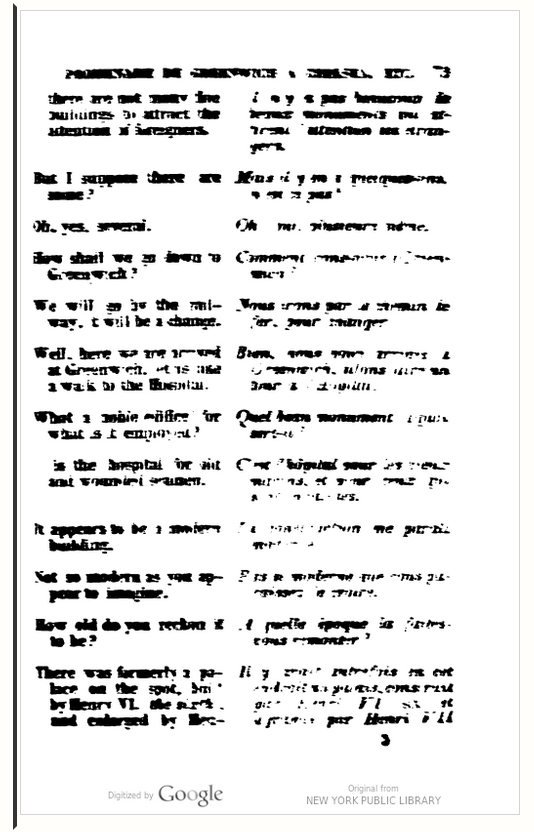
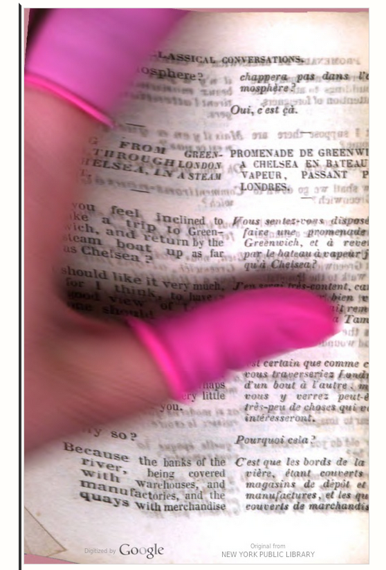
- P. Sadler, Manuel classique de conversations françaises et anglaises. I didn’t find the quote Barker mentioned in this on-line version; this is worse than microfilm and an example of the complete unreliability of Google books, seen in these images from the book.
Ah! Phrasebooks for travelers: now we are off on a whole other literary quest. And Nicolas Barker is still at it, for looking through his magazine The Book Collector (Vol 64 no 3, Autumn 2015) there’s an article by Nigel Stoughton about “The First Foreign Phrasebook” — Noel Van Barlement’s Colloquia et Dictionariolum from the sixteenth century. And what sort of phrases would a traveler to Flanders need to know? Here’s a conversation at the inn (in contemporary English):
“Sir doth it please you to have no other thing? Are you well?”
“Yea my shee frinde put out the candell, and come neerer to mee.”
It continues in the same vein but with the woman getting the upper hand. The subtext perhaps being you should know the language well before you start propositioning chambermaids.
Another reason it took so long to write Alphabets to Order was trying to find the sources of so many random quotes in the pre-Google era. One that eluded me for over a decade was a paragraph entitled “Anecdotes of Ants,” from a Ferguson Brother’s specimen (Edinburgh, 1846), found at Columbia (which houses the American Type Founders’ Collection formed by Henry L. Bullen). No book of this title exists: I just now typed it into the WorldCat.org database and up came Is the Internet changing the Way you Think? by John Brockman (Harper, 2011). Serendipity and a little bit creepy, since Brockman’s title has none of those keywords in it! But serendipity is the key. One day in late September 1995 I was driving through Boonville, California. I had no reason to be on that road other than a vague plan to drive West to the Pacific coast through the scenic Anderson Valley. Incidentally, Boonville is unique in having its own dialect, known as Boontling. It was a hot day and my companion asked me to stop for ice cream. Ices in hand we walked along the main street of this one-horse hamlet and saw a bookstore which naturally we had to visit. I didn’t find anything but chatted with the proprietor who was seated behind a display case containing his more valuable stock. Out of idle curiosity I asked to look at Anecdotes of the Animal Kingdom, Boston, 1860. It had the 1863 bookplate of the Sawyer family, who owned a local vineyard. The title-page has a wood engraving by Alexander Anderson. I flicked through, and there on page 330, saw “Anecdotes of Ants.” I paid $10 for the book and entered the world of Peter Parley, “a kindly omniscient old gentleman who answers the priggish inquires of children instructing them with a thin sugar-coating of fiction.” His books were in fact ghost-written by a team of scriveners, including a young Nathaniel Hawthorne, who referred to the author (real name Samuel Griswold Goodrich) as a “maggot who feeds on rich cheese.”
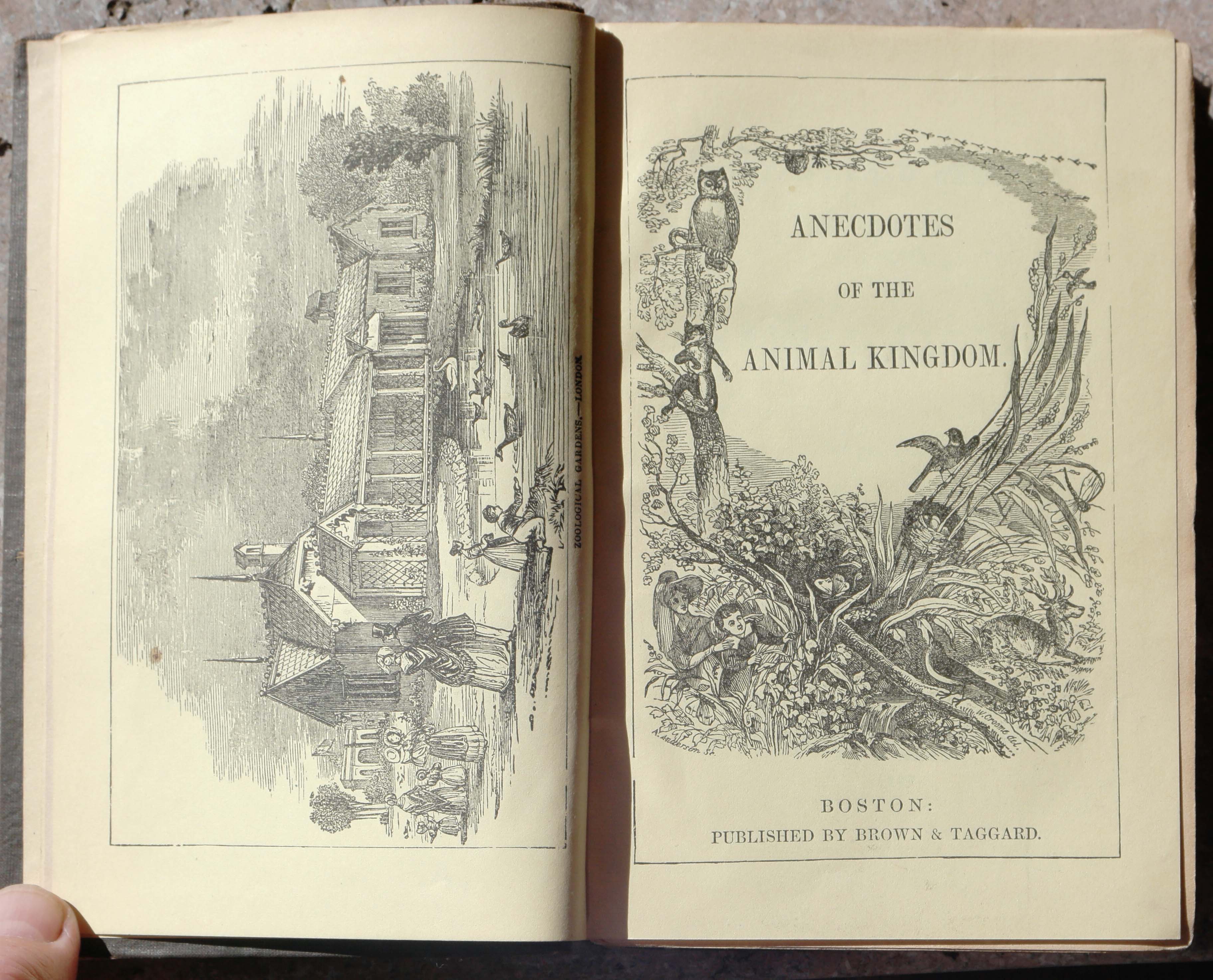
Peter Parley’s Anecdotes of the Animal Kingdom, Boston, 1860
Other forgotten Victorian authors surfaced in my research including the prolific English newspaperman Charles Knight and Charles Godfrey Leland author of many peculiar works in pidgin dialects, such as Hans Breitmann’s Barty.
I found wonderful quotes from Mark Twain with help from the archivists at U. C. Berkeley who searched his manuscripts for me and found the origin of the phrase “Jesus H. Christ” by his fellow apprentice on the Hannibal Courier, Wales McCormick. The full glorious account can now be read in The Autobiography of Mark Twain (Berkeley: UC Press, 2010, vol I: 458); I reveled in the American journalism of Lafcadio Hearn (and sorrowed over this long-dead author’s tragic biography) — he coined the phrase “concrete jungle” on a trip to New York; I discovered Will Lightfoot Visscher (again in a moment of serendipity in the final clearance sale of an old bookstore on San Francisco’s Mission Street: “All books $1 per bag — fill your own”). “Vissch” was a classic example of a knight of the road: an erudite typesticker who worked as a journalist, poet, editor and journeyman printer throughout the US, drinking and brawling his way through life without a care. I returned to “Vissch” for an extended visit in my later book, Typographical Tourists: Tales of Tramping Printers (Berkeley: Poltroon Press, 2012).
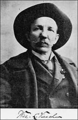
As I discovered, Colonel Visscher was born in Kentucky, wrote poems in Southern dialect and served on the Union side in the Civil War. He was only a hospital orderly, but any veteran from Kentucky took the honorific title “Colonel” after the war. As well as being a tramp printer, Vissch toured the country as a comedian, one highlight of his career being an attempt to stage an anti-Mormon farce in Salt Lake City. A reviewer said of him and his history of the Pony Express: “A terrible liar, a drunkard, a bad poet and a rascal, Visscher bore an amazing resemblance to W. C. Fields.”
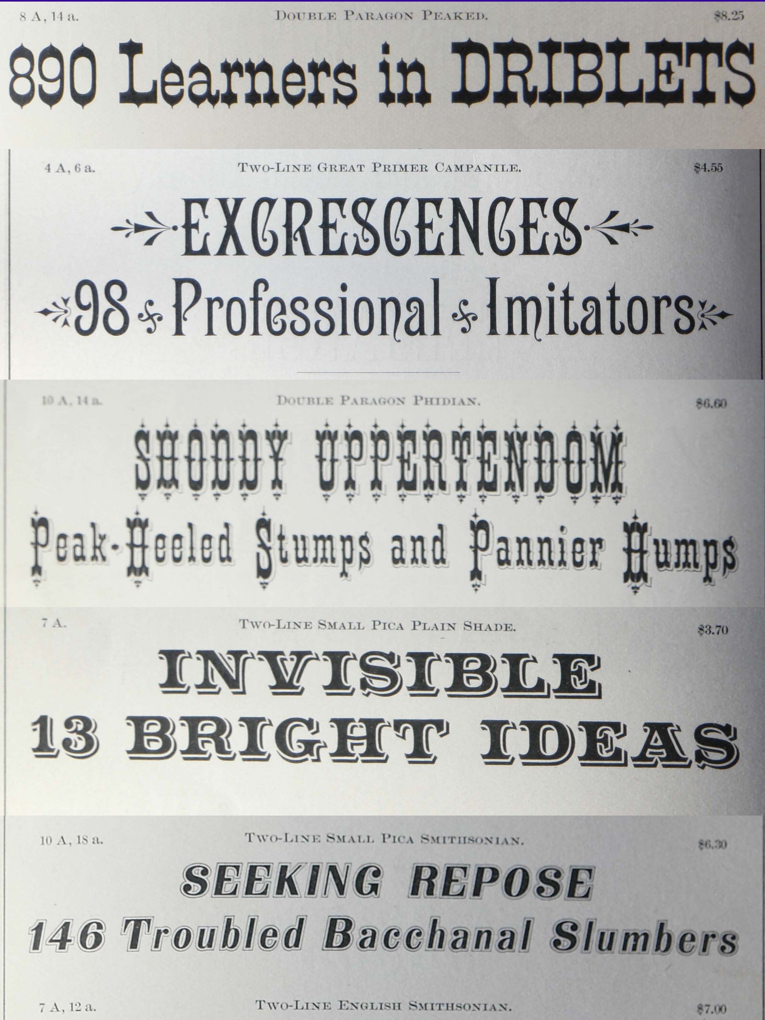
One critic thought my book should have reproduced the texts in the actual typefaces. That was logistically impossible, since I did not have photos of the thousands of samples I quoted, and it would have resulted in a junky-looking book, not much better than Fred Phillips’ effort (shown above). Books of Charles Henri Ford (Spare Parts, Athens: New View, 1966) and Bern Porter (Found Poems, New York: Something Else Press, 1972) come to mind as examples of this genre of found/clip art/collaged poetry. I did not want the reader to be distracted by wild type designs. You can see thousands of these samples, if you want, in the edition of William E. Loy’s Nineteenth-century American Designers & Engravers of Type that I co-edited with Stephen O. Saxe (New Castle, DE: Oak Knoll Press, 2009).
The printer who emerged as the key figure in the area of marketplace humor in the expanding commercial America of the post-Civil War period is Thomas W. MacKellar (1812–99). As a lad he apprenticed on a satirical paper, the New York Spy. He rose through the ranks at the L. Johnson typefoundry in Philadelphia until he became a partner, and ultimately the guiding force behind the conglomerate American Type Founders. He it was who gave the other typefounders permission to write stream-of-consciousness texts. He also had a good line in neologisms (Culinastic, daintiful, caudalogy). I will end with some samples, taken from his 14th specimen book (Philadelphia, 1882) and presented here, for this one time only, as a visual poem:
Thomas MacKellar poetry
or do it yourself
-30-